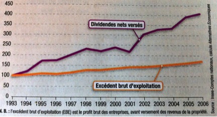
A very interesting text by Christian Cauvin, published in a special issue of Alternatives économiques, contains a particularly revealing graph. It addresses the growing weight of the financial economy.
Graph 1: Dividends and operating surpluses in France, indexed to 100 = 1993 level
N.B.: gross operating surplus (GOS) equals incorporated enterprises’ gross profit before payment of property income.
The author analyzes the graph as follows: “Businesses have not given up on conventional debt patterns, especially bank credit. However, market financing has progressed much more rapidly, to the point that bank credit no longer represents more than about a quarter of their equities, against nearly 40 per cent thirty years earlier. As a consequence of this new “shareholder capitalism,” dividends — paid to shareholders to remunerate their contribution in capital — have exploded, progressing much faster than the company’s profit and loss statement.”
As I read this commentary, I wondered how things were on our side of the Atlantic. Are shares rocketing here too, whilst operating income is more stable? Here is the same graph for Canada:
Graph 2: Dividends and operating surpluses in Canada, indexed to 100 = 2000 level


Source: Statistics Canada, CANSIM, Tableau 180-0003, author’s calculations
Unfortunately, the data available at Statistics Canada does not allow us to cover the same period as does Alternatives économiques. However, it is still interesting because it covers the last economic crisis, which started out as a financial crisis.
Let’s follow the chronological evolution and comment on the graph. From 2000 to 2003, operating income was falling slightly (ranging between 89 and 99), whilst dividends were rising (reaching 118 and 154). Afterwards (from 2004 to 2007), the curves run parallel and dividends retain their advantage.
When the crisis strikes, we see a huge difference (yet another!). While operating income dives and goes back up again, dividends rise swiftly (from 208 to 355 in just two years) before dropping. It’s a common reflex for businesses listed on the stock exchange: to increase dividends when times are rough to avoid shareholders selling their stock en masse. One of the consequences is that in the midst of a crisis — as people are being laid off because operating income is insufficient — more money is given away to shareholders.
This strategy is employed even though, according to a Forbes columnist, caring this much about shareholders is ‘the dumbest idea in the world‘. Furthermore, we see once more that crises do not strike each and everyone in the same way.
That being said, this graph could be the source of another statistical measure of financialization, which could complement the Jimbo Index, developed by Eric Pineault on the basis of work by Jim Stanford (which we have used in the past). While Stanford makes a comparison which allows us to see the general direction of the economy (by comparing real assets to financial assets), the comparison put forward by Cauvin allows us to see the difference between what is actually going on in corporations and its consequences on shareholders.
This article was written by Simon Tremblay-Pepin, a researcher with IRIS, a Montreal-based progressive think tank.
Graph 1 source: Cauvin, Christian, “L’insoutenable dynamique du capitalisme financier”, Alternatives économiques, special issue, n° 97, 3rd trimestre, 2013, p. 31.
Support rabble today!
We’re so glad you stopped by! Thanks for consuming rabble content this year.
rabble.ca is 100% reader and donor funded, so as an avid reader of our content, we hope you will consider gifting rabble with a donation during our summer fundraiser today.
Whether it be a one-time donation or a small monthly contribution, your support is critical to keep rabble writers producing the work you’ve come to rely on as a part of a healthy media diet.
Whether it be a one-time donation or a small monthly contribution, your support is critical to keep rabble writers producing the work you’ve come to rely on as a part of a healthy media diet.
Become a rabble rouser — donate to rabble.ca today.
Nick Seebruch, editor